
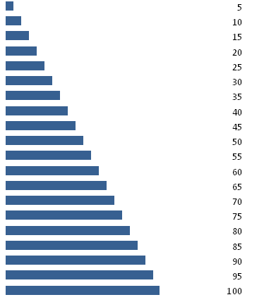
A Bar Graph uses rectangular bars that are proportional to a percentage value. It is useful for visualizing and comparing numbers. In SparkCode, Bar Graph are represented using number from 1 to 100. The diagram below illustrates the use of a simple Bar Graph.
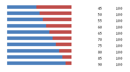
On top of that, the distribution of the percentage values can also be easily displayed in a Bar Graph. The diagram below illustrates using two series of numbers to show the distribution. A maximun of 6 series of numbers is supported in SparkCode.
This following is the option dialog for Bar Graphs. Each series of the numbers can be displayed in a unique color.
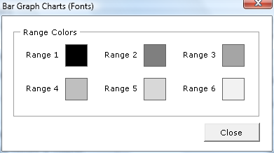
Range Colors
- Range 1 Color for Number Series 1
- Range 2 Color for Number Series 2
- Range 3 Color for Number Series 3
- Range 4 Color for Number Series 4
- Range 5 Color for Number Series 5
- Range 6 Color for Number Series 6